Showing posts with label Chad Minshew. Show all posts

Friday, August 20, 2010

Infected, This Is The Place...

Spoiler alert!  If you haven't read Scott Sigler's book, Infected, you probably should stop reading here, because I'm about to analyze the crap out of it.


Page one:

Scott Sigler's book, Infected, begins in medias res, a prologue of just two and a half pages of text in the actual book.  But it's a compelling and brilliantly written two and a half pages that neatly delivers the entire narrative of the story, telling you everything you need to know  about the motivation of the antagonist, the mindset of the protagonist, conflict and resolution.  It's an entire tragic story compressed into the tiniest and maybe most important bit of the book.  It's what sold me on the story and, coupled with how much of it takes place within the mind and the confined apartment of Perry Dawsey, it would be a challenging project I knew I wanted to make into a graphic novel.

My approach for this is, I wanted to tell the whole story visually, without relying on text to convey what is in the mind of Alida Garcia, the prologue protagonist.  So much of her story is about regret, about her shortcomings, and her inner struggles with both the demons in her past and the demons literally growing under her skin.  

As an illegal immigrant, her whole life had been a struggle, getting physically north across the border and establishing herself, with her husband.  Having her baby, an anchor baby that meant salvation for her relationship with Luis, her finally being able to live without fear from the INS, or "La Magra".  Her struggle with classes, moving up from poverty to a middle class life, the American Dream.

But then she became infected with another child of sorts, this strange infection that brought alien thoughts of paranoia, predatory insanity, with a northerly migration, mirroring Alida's during her early struggling years, of it's own driving it and her into some unknown part of desolate Michigan forest in the biting chill of winter, an environment quite alien to her warm Mexican upbringing.  Like a new male lion taking over a pride, it killed off the rival males and her cub, laying claim to her body and everything she was.

All that in two and a half pages!

I started out writing down everything I wanted to cover, all the events, all the emotions, then plotted out how long I wanted to spend on each bit, deciding how long I wanted the reader to dwell on this first beat.  I arrived at five pages of pretty dense storytelling.  A beginning, middle, and end, with three acts.  It could be a movie all on it's own.

Page one, I wanted to cover all the major points, the epic journey, the emotions, the paranoia, the almost schizophrenic nature of her inner struggle.

Panel one starts with Alida  trekking across the snow, missing a shoe, disheveled, she's fallen to her knees and is looking over her shoulder for something or someone chasing her.  We look down on her, this lesser pathetic and weak thing.  The branches of the tree above her come between us, the viewer, and her, the protagonist.  They spread across the page, from left to right like an infection.

The next five panels, four insets and one big one, demonstrate largely through close ups the struggle going on in her mind and in her body. 

We start with scratching the wrist until it's bloody, noticing the infected hand is holding a gun.  I was thinking of what it takes for a coyote to gnaw off it's own paw when caught in a trap, something that must take the most immense inner strength to do for the sake of survival.

Panel three, Alida sheds tears.  Regret, panic, fear, she's ready to give up, she just wants it all to end.

Panel four, the engagement and wedding ring on her left hand that symbolized everything she ever wanted in life, her family, love, the ability to afford such luxuries in America, to have enough money to buy gold and precious stones, and the pride of overcoming such gargantuan obstacles.  If not for the regret, it would certainly be inspiration.

Panel five, a suggestion from my editor, Bob Pendarvis, "I kinda wish one of the faces might've used a hand or two. nothing like adding a hand to a close-up to increase the "acting" quotient. like, maybe she's cradling her head in the third face, but then turns head behind her in the last, eyes peering between fingers"   It was a great suggestion that added a lot to the panel, where she demonstrates the evil has taken over, she has a gun she isn't afraid to use, and she is partially hiding her face, an act of deception.

This all culminates in a stylistic panel six, Alida looking over her shoulder, angry and paranoid, maybe at the viewer, maybe at the beginning of the next part of her journey, the train.

And finally, panel seven, a more realistic view of the train meandering down the tracks.

There's a world of difference between how the page started in thumbnails and where it wound up, here is my very rough first take layout to go over with the editor.


Next post: My approach to how the art is portrayed and why, techniques, materials, scanners and resolutions.  Followed by a page two analysis!

Tuesday, August 17, 2010

A Thick Skin and Honest Critique

For seven years, from when I was in year twelve in high school,  I was fortunate enough to be employed as a graphic designer at a great little firm in Florida.  I spent time making art by hand or in the computer,  learning to design logos and tshirts and billboards and anything else(minus web design) under the sun that could be printed.  I cut my teeth on photoshop and Corel.  For a couple years, I was also the Art Director(which really just meant I was salaried, I was responsible for everyone's work, and I went from working 40 hours a week to 60 hours a week for a very minor raise that washed away when I worked overtime).

When I was still so young, I have to say, it felt pretty fantastic to just be making art for a living.  And it's hard to imagine a better way to get your feet wet than diving right into the deep end of the pool, sink or swim.  But I like that sort of thing, the challenge of it.

What I learned was, in the end, that I didn't want to be a graphic designer.  That was the single biggest lesson I walked away with, and I consider it time well spent.  I also learned little things along the way, how to deal with customers, I learned not to fall in love with every little thing I did(because the customer or art director, regardless of the reason or benefit of it, always wanted a little change to great work, almost like adding their own little immortal bit or signature to the creative process).  I learned the value of a client and what it cost to lose one, I learned how process printing works, screen printing, embroidery, offset presses, I even learned automotive paint.

But the second most important lesson I learned was the value of critique.

Sure, we all enjoy praise, it feels warm and fuzzy.  Wow, that sure looks great.  I can't believe how good that looks, you're amazing!  Again and again, it never gets old, receiving praise feels good.  Damned good. Great, even.

But what purpose does praise really serve, in the practical sense, to an artist?  In it's essence, it's positive reinforcement which, logically speaking, is designed to get you to repeat a pattern of behavior.  How does that help an artist grow, retreading the same old path with repeated behavior?  The words "good enough" come to mind.  And how depressing must it be to become "good enough", call it quits, to mentally check out and coast the rest of the way through life?

To me, all life is can be summed up in a single sentence; Life is the pursuit of perfection.  That's it.  Once you achieve it, well, crap, you are the dog that caught the car, now what do you do?  A dog chasing cars seems kind of dumb, but it's the same thing we as artists do, we hone our artistic craft the way the dog hones his hunting craft, endlessly chasing perfection down the road, the closer we get, the more dust is kicked in our eyes and the more alive we feel.

If you want to grow as an artist, it doesn't help all that much to know what you got right, it doesn't help you to know it's the best work in the room.  What you need to know is what is wrong with it, what doesn't work.  Michaelangelo said every block of stone has a sculpture inside, it's the task of the sculptor to discover it.  In your work, the deeper you get into it, the harder it is to have perspective, what rough bit of stone needs to be cut away to really free the sculpture inside?

That's where a good artist is well served by a thick skin and honest critique.

If hearing your perspective is off, your composition looks thrown together, not thought out, and your anatomy sucks makes you feel like a lump of crap, you probably need to rethink how your brain is wired.  Whoever just told you that awful stuff about your work, the work you spent hours laboring over, that you lost sleep over, that you missed TV shows to work on, that you neglected relationships to slave at, that guy is one of the best assets you have.  That guy that you want to knee-jerk react to with a frown or a dirty remark under your breath, he just gave you more insight than all your formative years of praise from your mom and all who gazed in awe at the kitchen fridge magnet art gallery.

To be clear, "that sucks" is not critique.  Neither is "I don't like it", or any flavor of blather that doesn't speak about specific issues within the work in question.  That's not delivering critique, that's being a hater.  Learn to spot the difference.

If you can get a small group of honest people willing to really trash your work in your entourage, if you can restrain yourself from hating those guys for their tactless delivery, your work will grow in leaps and bounds.  If praise should be handed out, mete it to those guys, that's where positive reinforcement belongs, that's the sort of behavior you want repeated.  One of those guys is worth a thousand groupies lavishing shallow praise.

I had the good fortune to work with honest people who paid me for my work.  They expected a lot in return, they didn't tolerate mediocrity. They told me what was wrong and where and why, and if they could, how to fix it.  And rarely, if ever, did I hear praise for my work.  And it was the best time of my life in terms of artistic growth.

Saturday, August 7, 2010

The Protagonist Brain(part II)


Professor Paul Hudson taught me a lot of things during my time in the sequential art building at SCAD. He was a meticulous man with an incredible eye for detail, accuracy, perspective, anatomy. All things he brought to his amazing work, taught to his students, and imparted into their techniques. Invaluable technical knowledge that greatly informed and improved everything I've done since taking his classes back in 2004-2005.

But the single most important thing I soaked up was his endless pursuit of perfection in everything he does, under the mantra "A day without mistakes is a wasted day, as you learned nothing."

A healthy attitude to couple with a dislike for your own work. It keeps you from becoming bitter and drives you to continually reinvent your approach, refine your tools, explore alternate techniques. To generally try your damnedest to make daily progress towards the mirage on the horizon that is perfection and the complacency that would come with it. It's the recognition and the satisfaction that comes from looking at the work you did yesterday, seeing the faults and being pleased with finding them or having someone point it out(if you are so lucky).

Working on Scott Sigler's graphic novel adaptation of his book, "INFECTED", I thought a lot about my artistic approach, trying to keep in mind how the brain works, it's desire for simplicity and the clarity that can come with it, and the beauty and fascination you can impart with realistic perspective, details, lighting, everything you see in reality but usually lose in the process of making comics.

I decided upon a two pronged approach for the story, which, all characters and their various motivations aside, really has two opposing points of literal "view". The view of the infected, and the view of the uninfected.

The approach for the infected seemed like an easy enough problem to solve, throw in some ink washes, be a bit messy, impart some energy into the brush strokes. Some vertical panels to promote an overall sense of claustrophobia as the paranoia sets in and infection begins to cloud their minds, taking over.

For the uninfected parts of the story, I figured I would lean a bit more on clean line work, more intrinsic detail, a more traditional comic look.

For the uninfected, though, this posed a bit of a problem. How do I maintain a sense of unity with the art if I didn't come up with an alternate way of handling things to match the rich texture that ink washes can impart? Further, how do I make it as simple as possible for the reader to recognize the action, the characters, the moving parts of the story within each rendered panel equally?

I thought a bit about the work of Josh Middleton, who tries to remove all the unnecessary lines from his work, paring it down to it's essence, relying more on his colors to fill in the work. He does all his own colors, and the collaboration of mediums works really well together, as they inform each other, and maintain the same exact direction and goal in the hands of the same artist. I liked the idea of it and decided that the moving characters in both parts of the story, infected and uninfected, would share a more simple look, devoid of spotted blacks, intricate detail.

The backgrounds can be handled very differently, one with rendered washes with these stark characters popping out, the other either leaning on color or dealing with more richly illustrated backgrounds, with the bright, simple looking characters standing out equally.

It solves the problem of lending unity to two different looks within the same book, and helps the brain along in recognizing the characters, the movement, the energy of a scene that you might otherwise lose with a heavily detailed style.

But this would cause some crippling problems of it's own, as I would soon find out.

Wednesday, July 28, 2010

The Protagonist Brain(part I)

American philosopher and literary theorist, Kenneth Burke, defines man as "the symbol using (symbol-making, symbol-misusing) animal, inventor of the negative (or moralized by the negative), separated from his natural condition by instruments of his own making, goaded by the spirit of hierarchy (or moved by the sense of order), and rotten with perfection."

The brain is one big pattern matching machine. It views the world through expectations, categorizing things into larger groups for easier and faster processing. Ask a child to draw a tree, you'll likely get a brown vertical line in crayon with a plump green circle on top. It's not an actual tree they are picturing in their mind, it's shorthand for one, it's a hyper effecient symbol for a tree.

You would think that a photo of something is the fastest and best way to represent it, but it turns out, it may not be. Somehow, symbols, the simpler the better, have worked their way into our minds and form the basis for how we perceive and process all reality. You can extend this logic in many directions, street signs, logos, numbers and letters, silhouettes and even names, but they all boil down to an essence of communication.

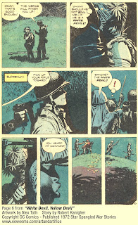
Alex Toth was one of the 20th century's best examples of distilling comics down to the barest essentials of visual storytelling. His work was always elegantly clean, clear, free of clutter and devoid of non-essential detail. He spent his life chasing the intellectual perfection of the perfectly told visually conveyed story.

In comics, the more detail you cram into something, the harder it is for the brain to make sense of it. All sense of energy becomes lost when you burden the reader with an abundance of minutiae, making it feel more like freeze frame photography than a kinetic explosion of movement.

This is one of the most essential things to consider when approaching your style, your storytelling, the pacing, how you want the reader to view your work and exactly how fast.


Tuesday, July 27, 2010

Getting Started...Light and Emotion in a Cup of Coffee


There's never a perfect place to begin an unfinished story.

So, diving right in, lets see some art.

This was part of a page I did in college, after reading a little about Will Eisner's "dirty water" technique. It's an easy technique that can allow the artist a lot of control over light without reliance on heavily spotted blacks. It would influence much of my later work.

When composing this page, I wanted to tell a simple story, someone having a cup of coffee, and how it made them feel. Three wide panels with two insets.

The three wide panels establish the story, at least as I saw it then. The morning ritual of preparing, pouring, then enjoying coffee. The two insets being close up facial reactions showing the human side of the story.

The two inset panel shapes took some consideration. I wanted them to convey a little something extra without hitting you in the face too terribly hard. So, knowing the western eye views everything from left to right, like how we read, I simply narrowed the first one, to imply a narrow outlook coming from the already grim and grumpy expression within. The second, with the coffee kicking in and life looking good, widens. A pretty simple trick that was fairly effective and wasn't terribly distracting.

I also wanted light to play a part, and it remains dark throughout, until the last panel, which is full of light, silhouetting the protagonist who is facing the day ahead, now that he has had his fix.

It's a solid page, but if I were to do it again, the first wide panel would have been a little earlier in the process of making the coffee, maybe grinding beans or something along those lines. Punch up the anticipation a bit more so the payoff feels a bit more important. I would have used an espresso machine, something more visually appealing to look at, done a little more research, looked a little further than my own kitchen for a model. I'm sure ten years from now, I will have a lot more problems with it, the road to perfection, mastery of the craft, it's a long one.